Victoria Douglas Counseling - Local Business
Introduction
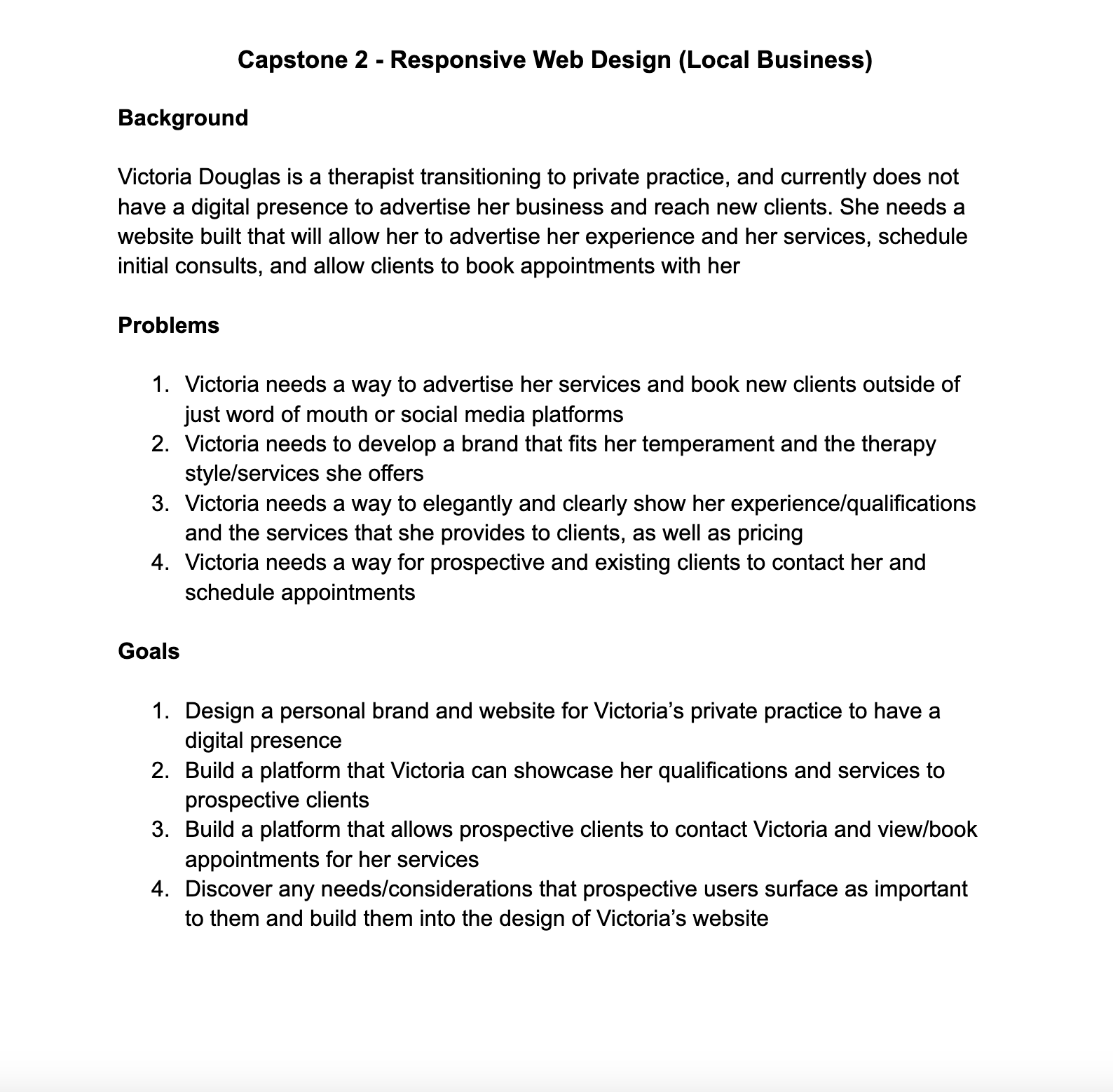
In this case study we’re going to walkthrough the process of building out the basic designs for a local therapy practice, Victoria Douglas Counseling.
The goal of this project was to create a responsive flow for a new local business. In this case I built the brand and flow from ground zero with the intention of helping a local therapist reach new clients and grow their local reach and impact, while properly communicating their services and reducing friction for current and prospective clients.
Research
Goals
My research goals with this project were to understand what is most important for therapists to communicate to their clients, and what items are viewed as most critical to a client when it comes to selecting a therapist that is right for their needs.
Research Methods
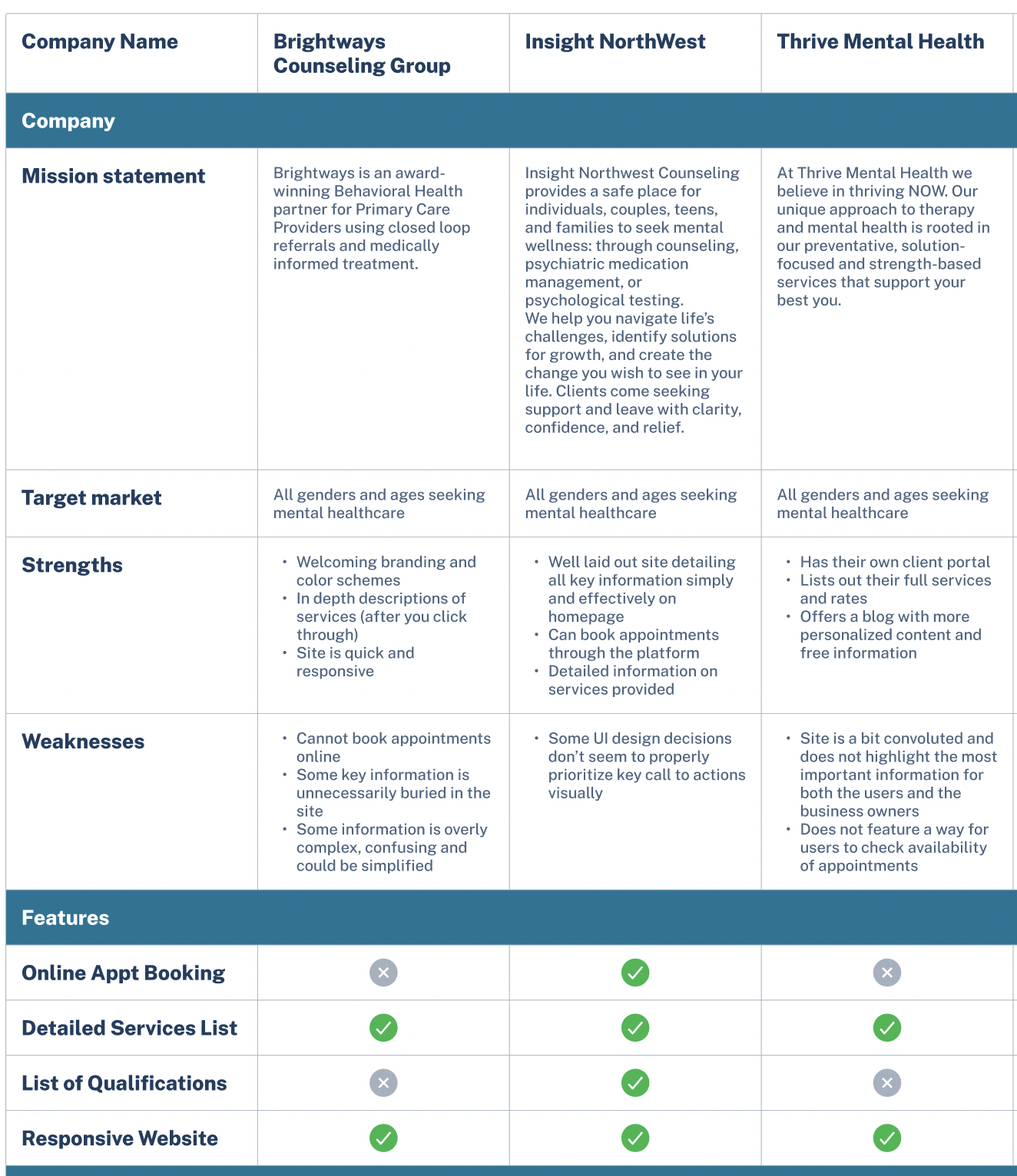
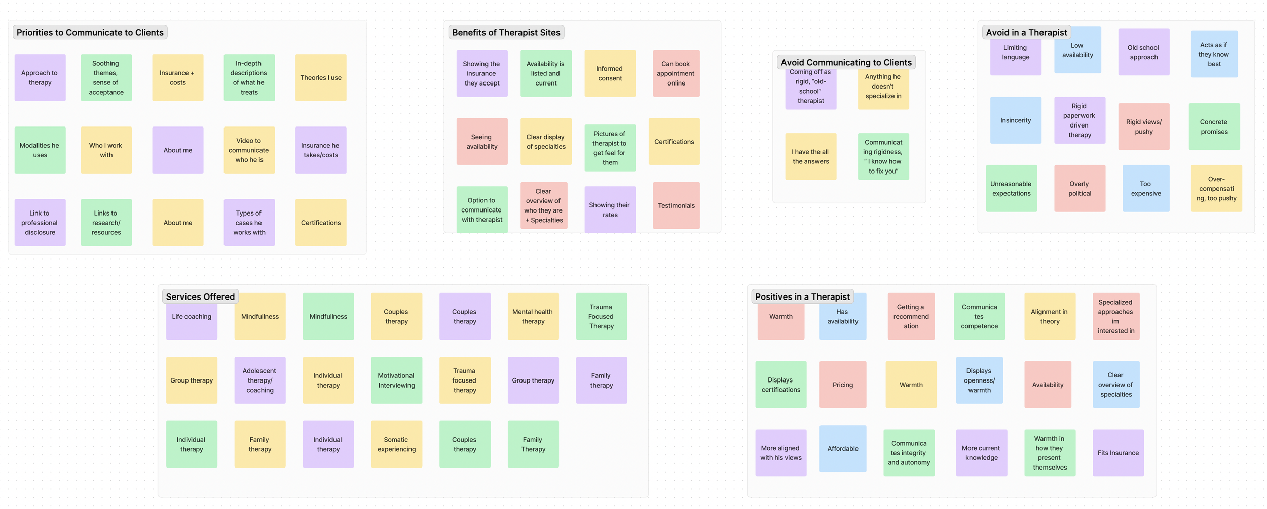
In order to gather the needed data I set out to collect and understand, I conducted extensive user interviews with both therapists as well as individuals seeking a mental health professional, used a card sort and ran a competitive analysis
Key Findings
Authenticity is Crucial
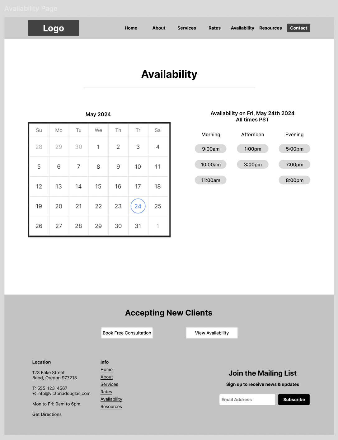
Availability with Boundaries
Most therapists found it important to be able to communicate their availability to prospective clients while still maintaining boundaries and being able to decide which clients they take on
For all therapists interviewed, being able to display an authentic snapshot of who they are and what they’re all about to a prospective client was a critical factor
Importance of Specializations
All participants felt that having the specializations of the therapist front and center and easily accessible was a top priority
Personas
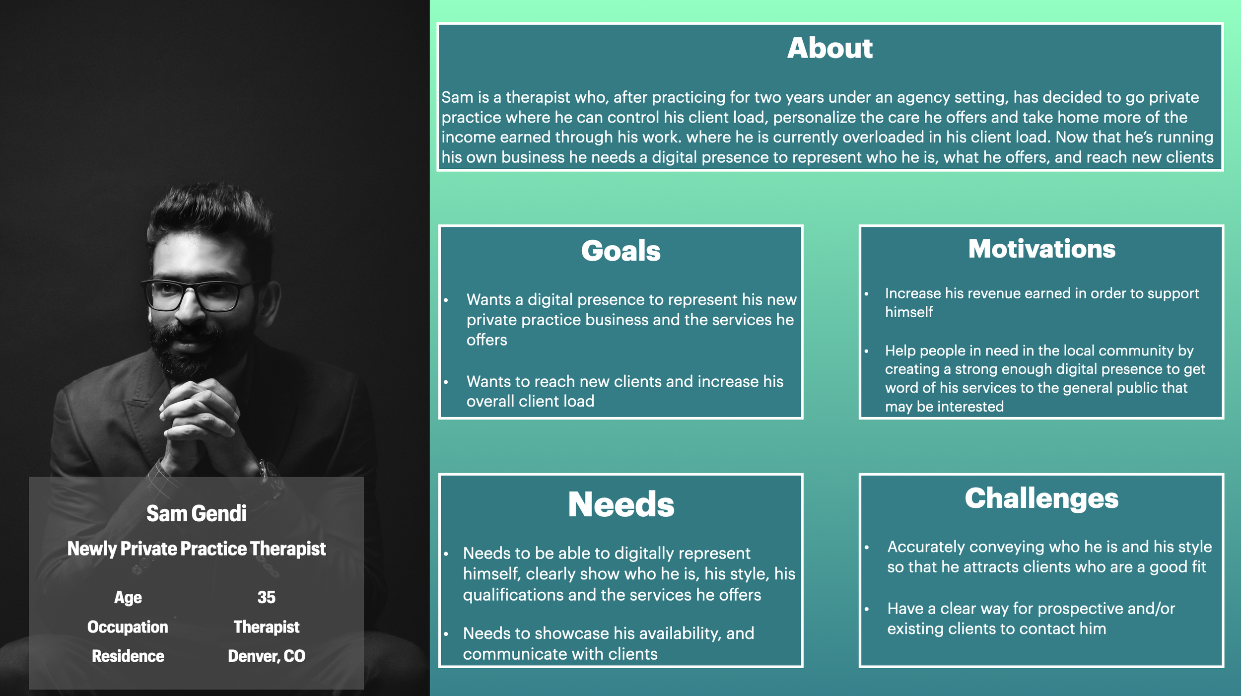
After concluding the research process and collecting the needed data points, I had a fairly thorough understanding of the problems to address for both therapists as well as their existing and prospective clients. To best incorporate the different perspectives documented, I created two personas connected to the different groups I’d be designing for - the “new private practice therapist”, and the “stressed professional seeking guidance with mental health”. With these two groups in mind I would then move my focus to finding solutions to the problems identified during the research phase.
Solutions
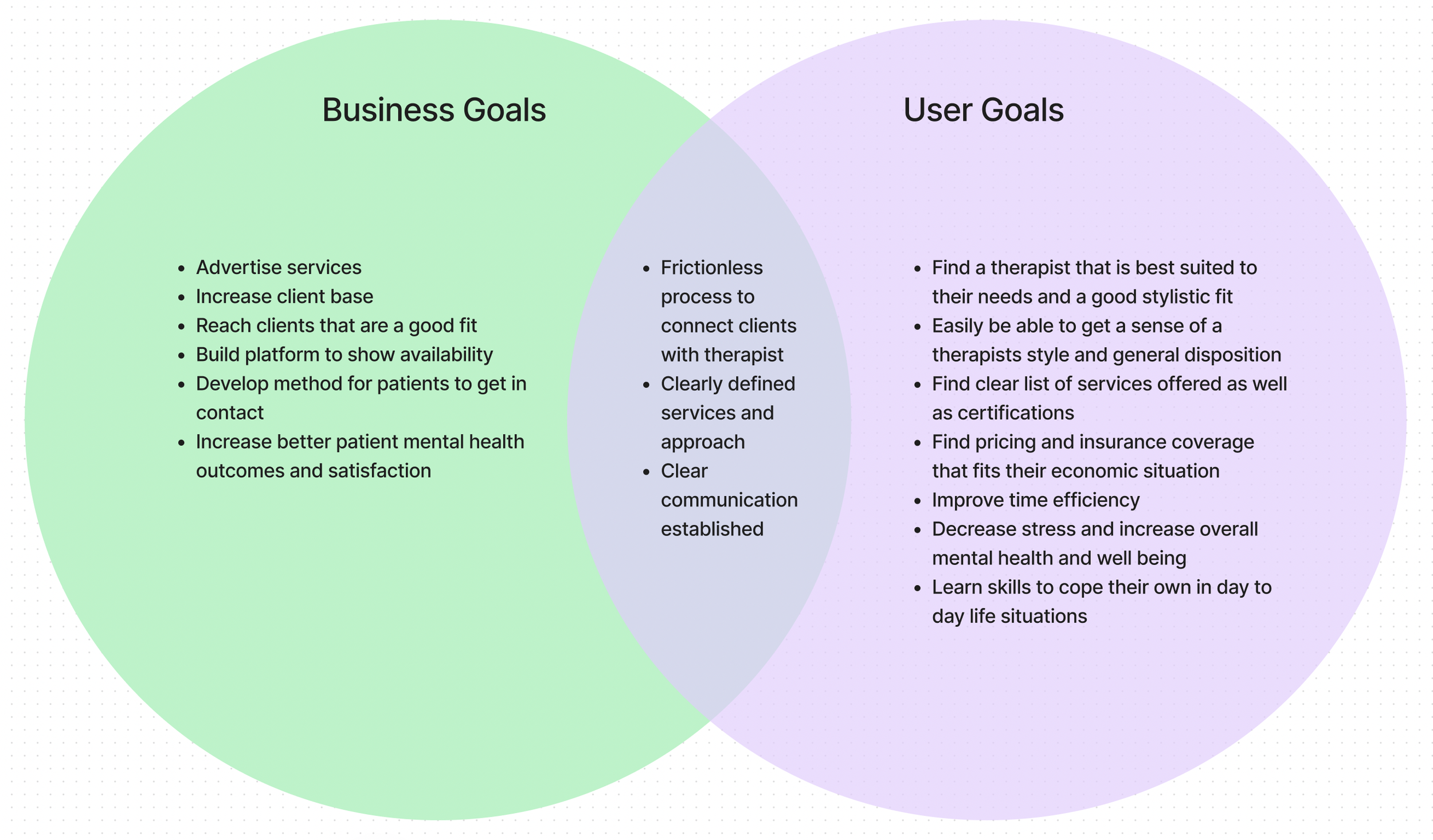
From both the primary and secondary research many common trends stood out. All therapists wanted to be able to communicate an authentic vision of who they are in order to attract clients that are a good fit, while prospective clients we’re also prioritizing therapists that clearly advertise their values and their modes of specialization. Allowing the prospective client to make inquiries and view availability was also critical to both parties.
Site Map
After gathering all the insights from the card sort and having my feature set and solutions in place, I was then able to lay the foundation for the Victoria Douglas Counseling website via the site map shown in the diagram below.
User Flows
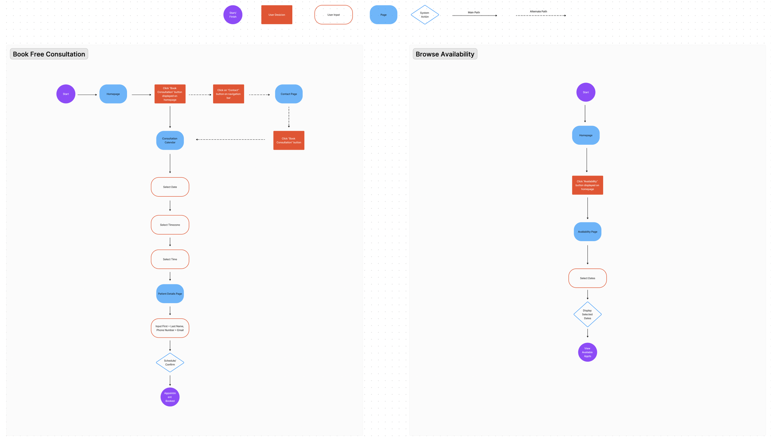
With the site map now in place, I then worked towards building out key user flows for the website. I focused on booking a consultation as well as browsing appointment availability.
Wire-Frames
With the research process wrapped and all data collected, I had a good initial understanding of the problems to solve and how it varied by different users. With the main audience decided on I could now work towards finding solutions to the problems raised within the research and begin to sketch out initial designs that could bring these solutions to life.
Low Fidelity
Homepage V1
Homepage V2
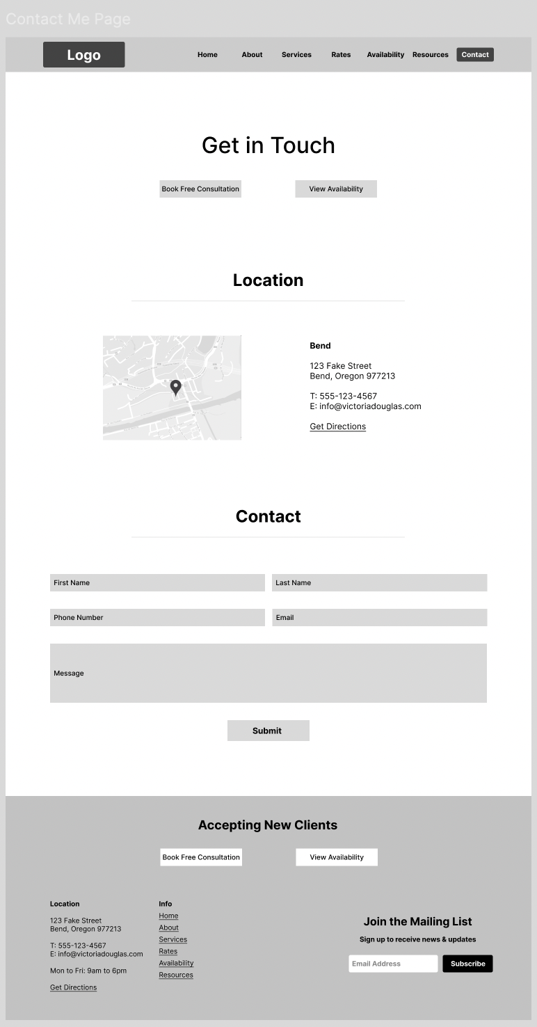
Contact Page
Learning Resources Page
UI Design
With the research completed and initial solutions sketched out I then set my attention to building out the UI and branding for the Victoria Douglas Counseling website, in order to start building towards a more high fidelity prototype.
Branding
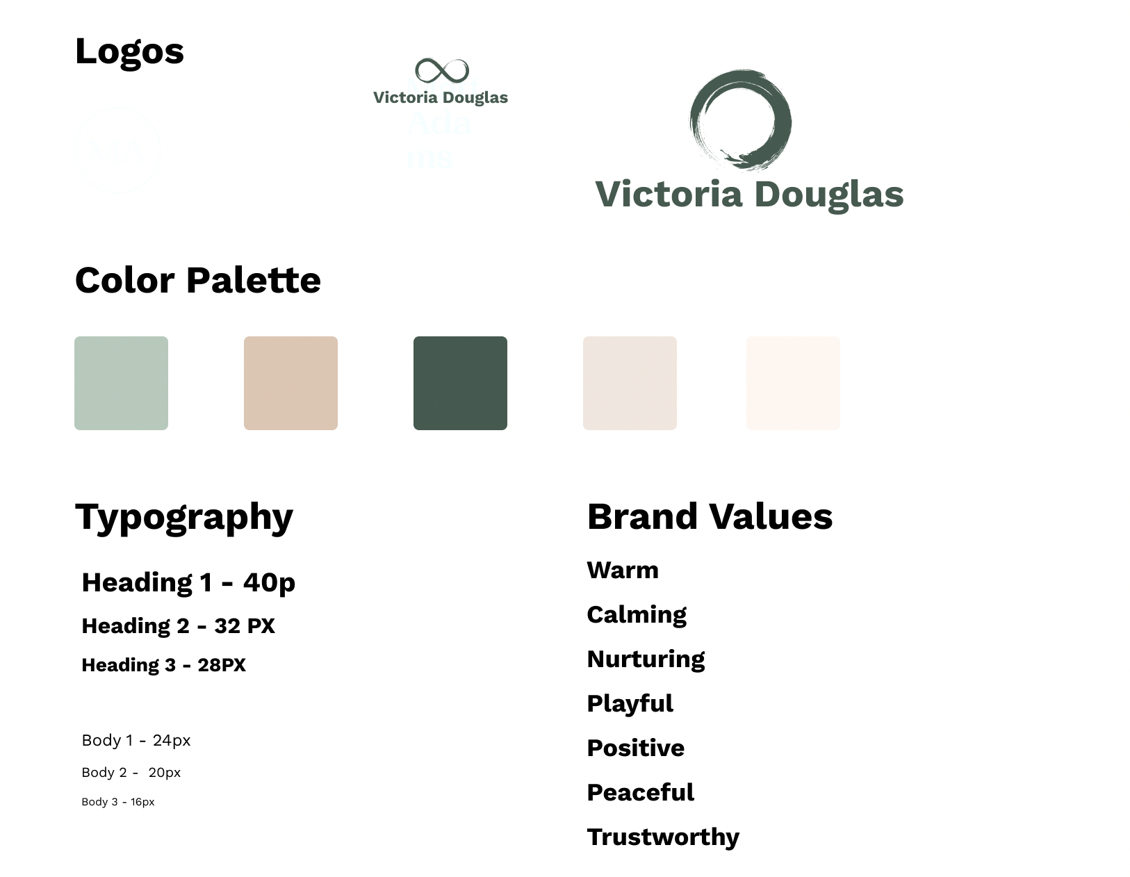
Building a brand from scratch I needed to develop the typography, logo, color palette and brand values. In talking to multiple local therapists, the overwhelming consensus was that warmth, calm, nurturing and peace were values that were important to communicate in their personal brand. With those values established I then chose a color palette thats peaceful and calming through a variety of different earth tones that give a grounding feel. From there I then settled on a typography that communicates both peace and professionalism. And finally I chose a logo based on the Japanese symbol of Satori, which represents enlightenment and wholeness.
High Fidelity Prototype
With the low-fidelity designs and UI elements and branding in place, it was then time to pull everything together into a high-fidelity prototype. WIth the high-fidelity prototype in place I could then move on to another round of usability testing to put these designs through their paces.
Usability Testing
I tested the designs with a varying mix of participants representing both the therapists and client/patient group. From this testing I reaffirmed that the varying needs of both groups were being met through the designs, and identified a few minor areas where iterations were needed in order to streamline the experience and remove friction.
Final Design
With the usability tests wrapped and the feedback gathered, I then turned towards iterations based on this feedback and pulled together the final designs for the project. Overall I was very happy with the results and the experience gained throughout the process.

