Designing an End to End Application for ImageConnect
Project Introduction
In this case study we’re going to walkthrough the process of building out the MVP for Image Connect, a platform designed to connect photographers with potential clients and streamline the process of booking contracts. The project goals were to build an end-to-end product that could reduce the friction for both photographers and their clients in the process of connecting each other and booking work.
Role: UX/UI Designer
Timeline:

Discovery Phase
Research
Goals
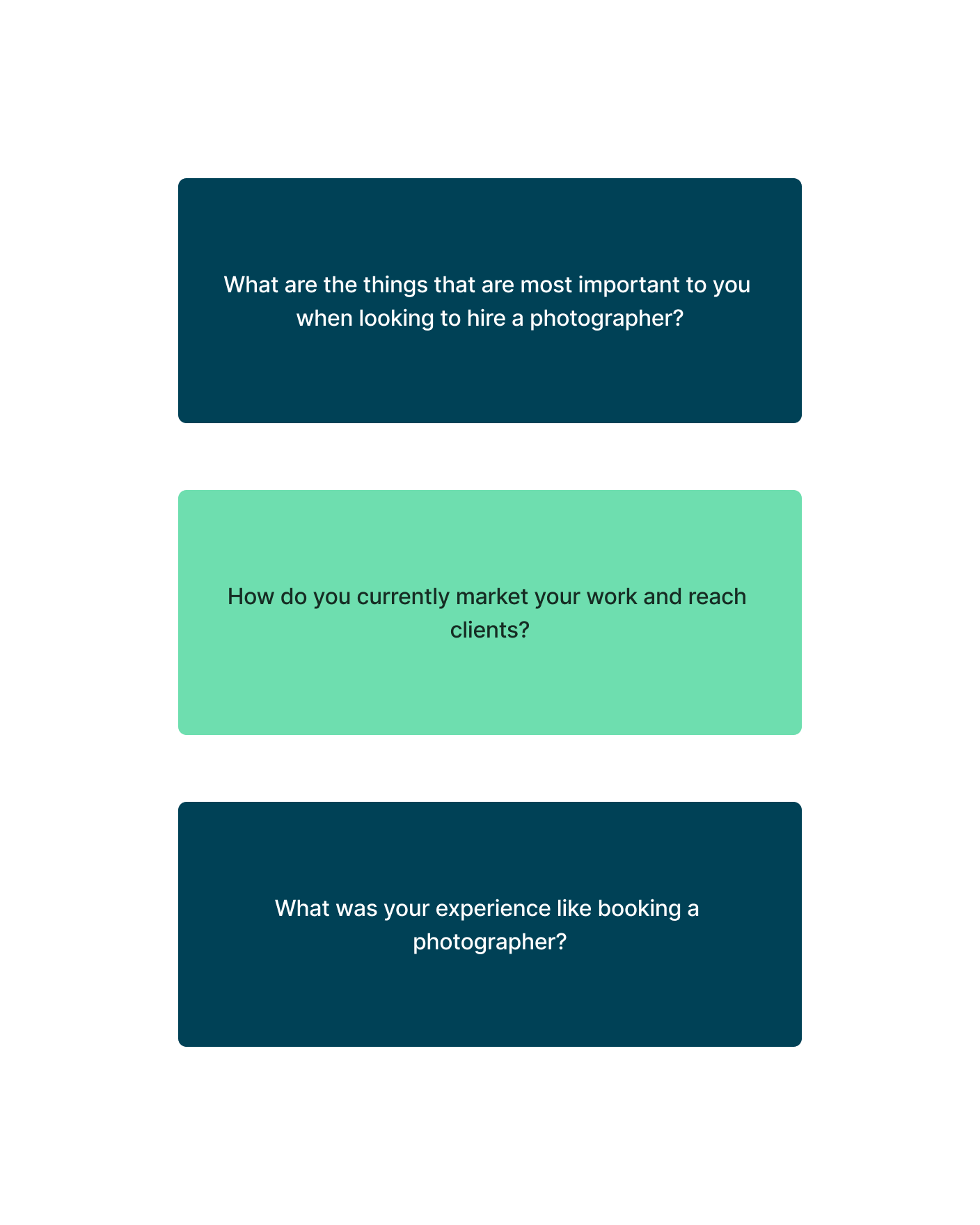
My goal with the research process was to understand how users currently went about the process of finding and booking photographers, and what where the major areas of friction were and what they hoped could be improved.
Objectives
Understand what users look for and prioritize when hiring a photographer
Document the different pain points and areas of friction users experience when searching for and hiring photographers
Understand how photographers look to display their work and connect with potential clients
Research Methods
Extensive user interviews
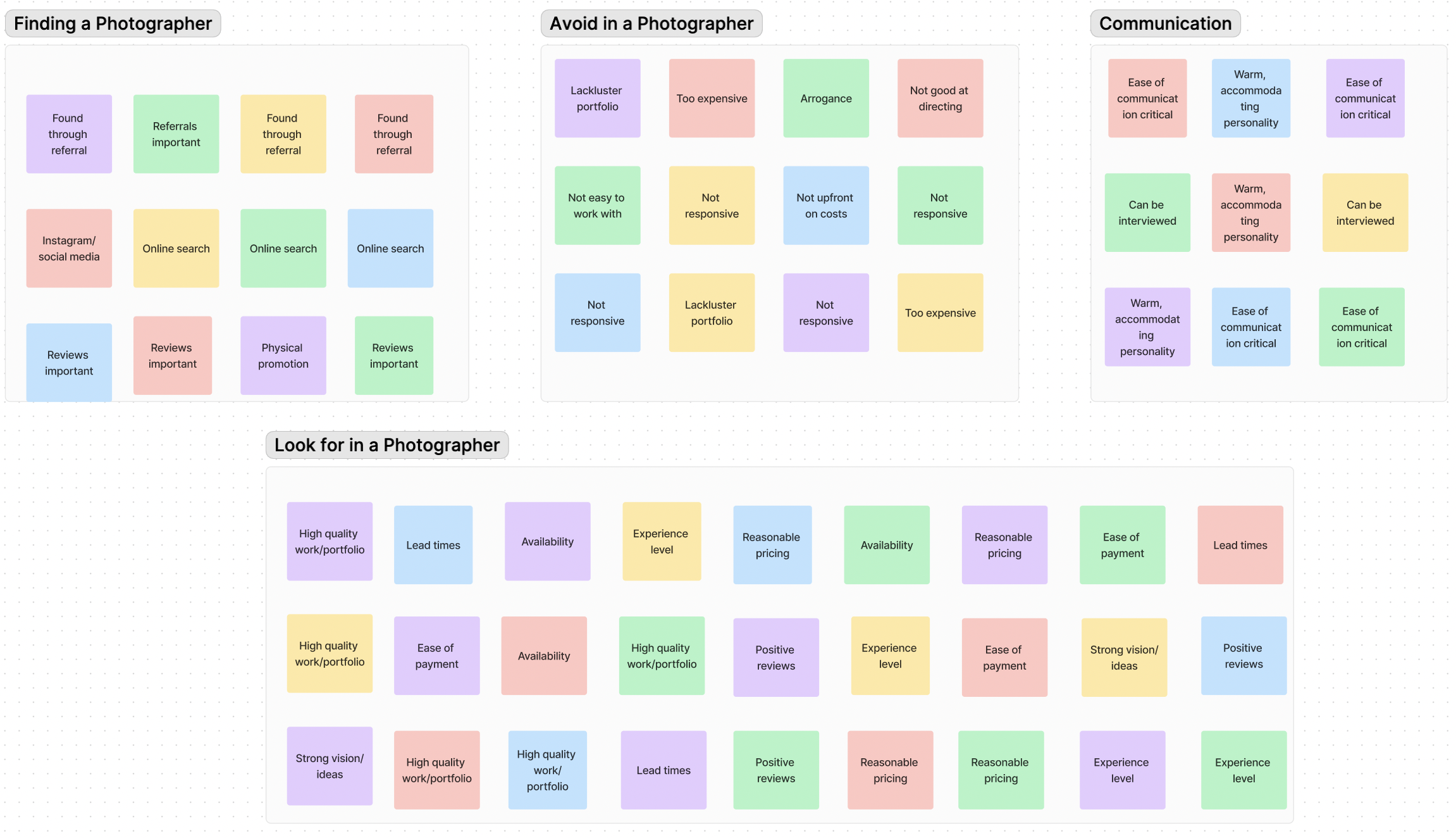
Card sort
Competitive analysis
Key Findings
Consolidating Experiences
Need for Key Info
Nearly all participants cited the importance of seeing review for photographers as well as portfolio and references as being an important factor needing high visibility
All participants noted a wide range of different platforms used for communication and payment, and the reality of it needing to be streamlined
Setting Expectations
Most participants stressed communication and being able to set clear expectations upfront for scope of work to avoid mistakes and contract issues
Personas
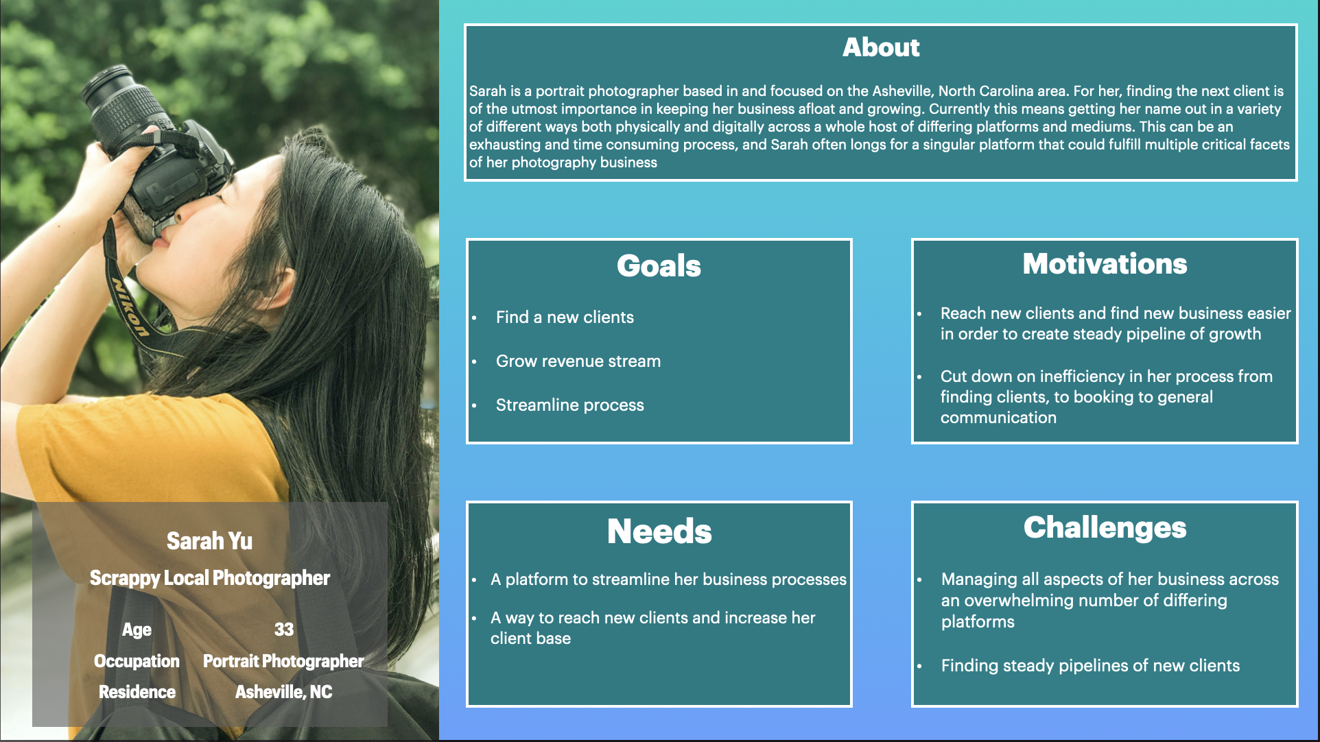
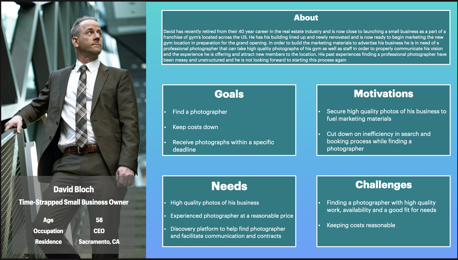
With the research completed and data points collected, I was able to identify the major problem areas and begin to ideate how to solve these issues for both user groups. To encapsulate the two different sets of users that would leverage the platform, I created two distinct personas representative of each: the “scrappy local photographer” and the “time-strapped small business owner”. Keeping these two groups in mind, I would then move my focus to starting to build out solutions.
Solutions
Various common priorities and points of friction were identified coming out of the primary and secondary research process. One of the biggest issues with both user groups was that there are too many different platforms and modes of communication involved in the process, and it could be drastically improved by streamlining all of these elements into one central platform. There were also clear issues in the research process for users looking to find a photographer, and the need for a variety of information upfront was shared across participants. With this feedback in mind I then began designing solutions that could address these needs.
Site Map
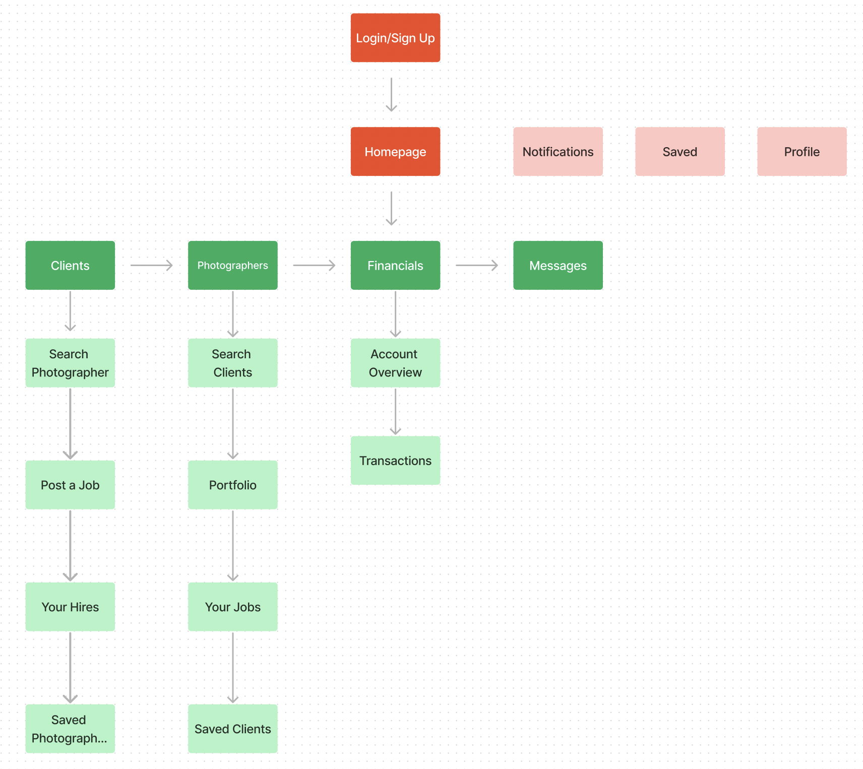
After gathering crucial insights via the card sort and having my feature set and solutions in place, I was then able to lay the foundation for the Heartspace platform via the site map shown in the diagram below.
User Flows
With my site map now in place, I then worked towards building out key user flows for Image Connect. I focused on the user creating their account as well as going through the process of searching for and booking a photographer.
Wire-Frames
With the research process wrapped and all data collected, I had a good initial understanding of the problems to solve and how it varied by different users. With the main audience decided on I could now work towards finding solutions to the problems raised within the research and begin to sketch out initial designs that could bring these solutions to life.
Low Fidelity
Sign Up Page
Homepage
Profile Page
Booking Page
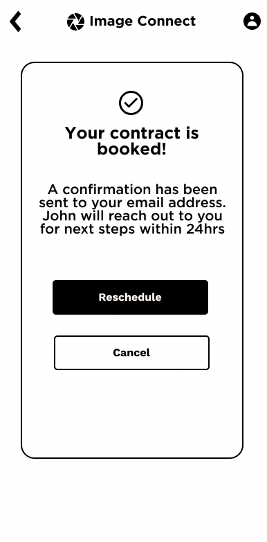
Confirmation Page
UI Design
With the research completed and initial solutions sketched out I then set my attention to building out the UI and branding for the Image Connect platform, in order to start building towards a more high fidelity prototype.
Branding
With Image Connect I needed to build a brand from the ground up. This process included creating the logo, color palette, brand values and typography. Given the business oriented nature of the platform as well as the subject matter being photography, I felt the brand values that made the most sense were professionalism, trustworthiness, creativity, positivity and peace. With this in mind I chose a color palette that aligned with and communicated these values. I chose a navy/turquoise blue to help instill a sense of trustworthiness and professionalism, as well as a seafoam green as an accent to highlight the creative nature of the medium and to lend a sense of positivity and peacefulness. For the logo I incorporated the well-known visage of a camera’s aperture to lend a clear and immediate symbol for what the platform is all about.
High Fidelity Prototype
With the low-fidelity designs and UI elements and branding in place, it was then time to pull everything together into a high-fidelity prototype. WIth the high-fidelity prototype built out I could then move on to another round of usability testing and pressure test these designs to identify iterations needed.
Usability Testing
I tested the designs with a varying mix of participants representing both the photographer and client groups. From this testing I reaffirmed that the varying needs of both groups were being met through the designs, and identified a few minor areas where iterations were needed in order to streamline the experience and remove friction.
Final Design
With the usability tests wrapped and the feedback gathered, I then turned towards iterations based on this feedback and pulled together the final designs for the project. There were only minor iterations required, mainly focused on quality of life improvements and improvements in wording that made certain actions more clear and overt. With these in place I was very satisfied with how the final designs turned out and feel that they met the needs originally identified by the research and users interviewed.

